Poverty and income trends continue to paint a bleak picture for working families
The 2010 poverty and income data released yesterday morning by the U.S. Census Bureau are yet another reminder of the continued weight of the Great Recession on families in the United States. The Great Recession officially ended in the summer of 2009, but the labor market continued deteriorating through the end of 2009, and the modest economic growth in 2010 was not enough to compensate for those losses. From 2009 to 2010, the number of jobs fell by 658,000, the unemployment rate increased from 9.3 percent to 9.6 percent, and the share of unemployed workers who had been unemployed for more than six months climbed from 31.2 percent to 43.3 percent. Thanks to this deterioration in the labor market, incomes dropped and poverty rose.
AUDIO: Listen to EPI’s press call about the 2010 report
Key findings from the Census Bureau’s report
Poverty
How did the American Recovery and Reinvestment Act of 2009 (ARRA) affect the 2010 poverty and income numbers? Because ARRA was passed in February and was in the process of ramping up through the end of 2009, its full impact was felt in 2010. ARRA primarily affected these numbers by creating and saving jobs, the earnings from which otherwise would not have been there supporting family incomes. The Congressional Budget Office estimates that the Recovery Act created or saved around one million full-time equivalent jobs in 2009, and 3.4 million jobs in 2010. Without these jobs, the decline in income and increase in poverty would have been much more dramatic. In other words, the new Census Bureau report is ugly, but without ARRA, it would have been much uglier. This underscores the growing impact of the end of ARRA—in the current quarter, ARRA is supporting only 2.3 million full-time equivalent jobs, and the number of jobs supported drops to half a million by the fourth quarter of 2012. This means that the loss of the boost from government action is—and without additional intervention will continue to be—a substantial drag on jobs and family income.
What about the direct income supports in ARRA? Of three major income supports in the stimulus—unemployment insurance, nutritional assistance (food stamps), and tax cuts—only unemployment insurance is counted in the income numbers just released; the income numbers include cash income received from programs such as unemployment insurance, but exclude noncash benefits like food stamps, and are measured before payments of taxes, so they do not reflect reductions in taxes. While unemployment insurance benefits replace a maximum of half of a worker’s prior earnings, these benefits went to workers who were laid off and who had low odds of quickly finding another job (in 2010, there were 5.3 unemployed workers per job opening on average). In other words, these unemployment benefits went to families that otherwise would likely have suffered even steeper income declines, and in some cases dropped below the poverty line. Census data show that 3.2 million people were kept out of poverty in 2010 by unemployment insurance benefits alone.
Poverty: Record highs
Between 2009 and 2010, an additional 2.6 million people slipped below the poverty line, as the poverty rate increased from 14.3 percent to 15.1 percent. The rate represents 46.2 million people living in poverty in the United States. The last time the poverty rate was higher was in 1983, when it was 15.2 percent (as shown in Figure A).

The poverty rate for children in 2010 was 22.0 percent, higher than the overall rate and up more (1.3 percentage-points) than the overall poverty rate, which increased 0.8 percentage points from 2009 to 2010. The 2010 “children’s poverty rate” represents 16.4 million kids living in poverty. In 2010, more than a third—35.5 percent— of all people living in poverty were children.
Nearly all of the decline in poverty achieved during the business cycle of the 1990s has now been reversed. From 1989 to 2000, overall poverty declined by 1.5 percentage points, and child poverty dropped by 3.4 percentage points. From 2000 to 2010, however, poverty increased overall by 3.8 percentage points, and by 5.8 percentage points among children. The large increase in poverty suggests that as anti-poverty policies have come to depend more on paid work as the main pathway out of poverty, the safety net has become less effective in reducing economic hardship when the economy and job market are underperforming.

The poverty rate for working-age people, those 18-64 years old, increased by 0.7 percentage points, from 12.9 percent in 2009 to 13.7 percent 2010, the highest rate since the series began in 1966 (Figure B). Over the same five decades, the poverty rate for persons older than 65 dropped precipitously, due in part to Social Security payments, which have effectively lifted millions of elderly Americans out of poverty. In 2010, the elderly poverty rate, 9.0 percent, was statistically unchanged from 2009.

Figure C displays the share of the population falling below half of the poverty line from 1975–2010. In 2010, 50 percent of the poverty line for a two-adult two-child family was $11,057. This measure tracks the depth of poverty, those living on half the subsistence rate. In 2010, 6.7 percent of people were living below half of the poverty line, up 0.4 percentage points since 2009—a record high share of the population in deep poverty since the Census Bureau began tracking this statistic in 1975. Not shown in the figure but alarming: Nearly one in 10 children (9.9 percent) were below half the poverty line in 2010, up from 9.3 percent in 2009.

As shown in Figure D, poverty rates and changes in those rates have varied across racial and ethnic groups. Non-Hispanic whites experienced the lowest rate of poverty at 9.9 percent, while the rates for blacks and Hispanics were more than two-and-a-half times higher at 27.4 percent and 26.6 percent, respectively. Poverty rates also increased more between 2009 and 2010 for blacks and Hispanics than for other groups.

The 2000s have all but erased any gains to reducing poverty in the 1990s. This recession has only exacerbated the damaging trends over the last decade, leaving some of the most vulnerable populations with large shares living below the poverty line. Figure E shows changes over time in poverty rates for particularly vulnerable populations—children, racial and ethnic minority children, and single-mother families. From 2000 to 2010, black children experienced a 7.9 percentage-point increase in poverty, reaching 39.1 percent. Hispanic children experienced an increase of 6.6 percentage points over the same period, reaching 35.0 percent.
For families headed by single mothers, there was a 7.7 percentage point jump from 2000 to 2010 to 40.7 percent. In 2010, 4.1 million of the 7.0 million families living in poverty were headed by single moms.
Income: Another lost year in a lost decade
From 2009 to 2010, median household income, adjusted for inflation, fell from $50,599 to $49,445, a decline of $1,154, or 2.3 percent. Working-age households—those with a head of household younger than 65 years old—experienced even larger declines because they are most exposed to the labor market and therefore most likely to be affected when the labor market deteriorates. The median income of working-age households fell from $56,742 in 2009 to $55,276 in 2010, a decline of $1,466, or 2.6 percent.

Figure F shows real median income over the last three decades for all households and, starting in 1994 when the data became available, for working-age households. A key point here is the comparison between business cycles. From 1979 to 1989, real median income grew $3,002 (from $46,074 to $49,076); from 1989-2000, it grew $4,088, (from $49,076 to $53,164). But for the first time on record, over the business cycle from 2000-07, incomes did not rise, but fell slightly, from $53,164 to $52,823. And with the weak labor market over this period, the real median income of working-age households fell significantly, from $61,574 to $59,460. This means that working families are weathering the current economic downturn on the heels of one of the worst economic expansions on record.
These figures show that 2010 was but another year of income declines in a decade of declines: From 2000 to 2010, median income for working-age households fell from $61,574 to $55,276, a decline of roughly $6,300, which is more than 10 percent.

Disparities in incomes among racial and ethnic subgroups grew in 2010, as racial and ethnic minorities experienced particularly large income declines, with African Americans getting hit the hardest. Figure G shows real median household income for racial and ethnic subgroups over the last two decades. The median income of non-Hispanic whites declined by 1.3 percent in 2010 and has declined by 5.4 percent since the start of the recession in 2007 . (In dollar terms, it fell from $57,752 to $54,620 over this period). The median African American household experienced a decline of 3.2 percent in 2010 and a total decline of 10.1 percent since 2007 (falling from $35,665 to $32,068). The median Hispanic household experienced a decline of 2.3 percent in 2010 and a total decline of 7.2 percent since 2007 (falling from $40,673 to $37,759).
The Great Recession and its aftermath have wiped out all improvements in median black income since 1996, all improvements in median Hispanic income since 1998, and all improvements in median white income since 1997. The median black household is now bringing in $5,494 less than it did 10 years ago (a drop of 14.6 percent) and the median Hispanic household is now bringing in $4,235 less than it did 10 years ago (a drop of 10.1 percent).

There were losses across the income distribution in 2010, particularly at the very bottom and the very top (see Figure H). In 2010, incomes of families in the middle fifth of the income distribution fell 0.9 percent, for a total decline of 6.6 percent since 2007. Families at the low end of the scale were hit harder, with the bottom fifth losing 3.5 percent in 2010 and 11.3 percent from 2007 to 2010. The top fifth lost 2.7 percent in 2010, but since their losses in the prior two years were modest, the net change from 2007 to 2010 was a relatively modest 4.5 percent. The rise in inequality over the last three years compounds thirty years of increasing inequality. Furthermore, with unemployment expected to remain high for years to come, inequality is likely to increase because weak labor markets have a larger negative impact on income at the middle and low end of the income distribution.
Particularly astonishing over the last three years has been the drop in the number of earners working full-time (35 hours or more per week) and full-year (at least 50 weeks, including paid time off). Between 2007 and 2010, there was a 9.4 million decline in the number of people with full-time, full-year employment and a 3.9 million increase in the number of people with part-time and/or part-year jobs.

As Table 1 shows, a disproportionate share of the erosion in full-time, full-year work over this period was among men—the number of men working full-time, full-year dropped by about 6.6 million between 2007 and 2010, while there was a 2.8 million drop in the number of women working full-time, full-year. However, focusing just on the change from 2009 to 2010, the gender dynamics were reversed, with a 754,000 decline in total employment among men and an 854,000 decline among women. Furthermore, losses were larger among part-time and/or part-year workers in 2010 than among full-time full-year workers, both male and female. Although it is not depicted in the table, the number of “involuntarily part-time workers”—workers who work part-time but want a full-time job (from the Census Bureau’s Current Population Survey)—was virtually unchanged from 2009 to 2010, after increasing by 4.5 million between 2007 and 2009.

In 2010, the median male working full-time, full-year experienced a slight drop in real earnings of 0.4 percent, from $47,905 to $47,715, while the median female working full-time, full-year experienced very little change, with an increase of 0.1 percent, from $36,877 to $36,931 (see Figure I). The persistent high unemployment dampens earnings growth even for those who have full-time, year-round employment. Looking from 2007 to 2010, the shift from full-time, full-year employment to part-time and/or part-year employment contributed to the overall drop in median earnings: The annual inflation-adjusted earnings for the median male worker dropped from $38,524 to $36,676 between 2007 and 2010, and for the female median worker from $27,212 to $26,552.
Conclusion
The new data on income and poverty underscore the real, human consequences of the economic downturn. The labor market is the core building block of family incomes—when the labor market falters and people lose work, hours, and wages, family incomes drop and poverty rises. The Census Bureau’s report shows that much of the income and anti-poverty gains made in the 1990s have been more than erased due to both the weak business cycle from 2000-07 and the lasting effects of the Great Recession. While the Recovery Act stemmed the losses from the Great Recession, it was never big enough to right the economic ship given the scale of the crisis. With unemployment expected to stay above 8 percent well into 2014, it is time for Congress to once again act boldly to create jobs so that America’s residents have the work they need to provide for their families. The jobs plan that President Obama announced last week takes an important step in the direction of a solution that matches the scale of the ongoing crisis. For more on what we can and should be pursuing to generate jobs, see EPI’s Putting America Back to Work.
If one takes the official broader definition of unemployment, or U6, in July at 16.1%, the ratio becomes even worse, 7.78* unemployed people per each job opening for July. Below is the graph of number of unemployed, using the broader U6 unemployment definition, per job opening.
If you do not like the use of U6 to look at the real number of people looking for a job to actual opportunities, consider this number. In July 2011, of those not in the labor force, 6,575,000 were actually wanting a job. U-6 only includes 2,785,000 of this number.
The rates below mean the number of openings, hires, fires percentage of the total employment. Openings are added to the total employment for it's ratio.
Believe this or not, one month past the so called end of the Great Recession, July 2009, job openings have only increased by 1,116,000. July 2009 was the low point of job openings, 2,112,000. That's pathetic. In March 2007, a few months before the start of the recession (December, 2007), the number of job openings was 4,755,000.
We can see some of labor market malaise in the actual hires from July, 3,984,000, which declined by -74,000, or -1.82% from June.

Below are total job separations, 3,920,000, which is a monthly decrease of -73,000 or -1.83%. The term separation means you're out of a job through a firing, layoff, quitting or retirement, so a decrease is good. Yet, notice how separations is almost equal to the number of hires, 3,984,000. Take this as a symptom of the disposable worker syndrome.
The number of quits or voluntary job separations are still dangerously close to the number of fires, although improved from November 2010, as well as June 2011. Want a choice of employers? Doesn't seem to be much of an option today. Quits were 50% of the total separations whereas layoffs and fires were 43% in July. In June, quits were 48%, whereas layoffs and fires were 44%, so a slight, but certainly not enough, improvement.
Below are quits minus discharges and layoffs. When quits comes close to firings that means people have little choice in employment. You want to see choice, or quits, rise and be much higher than firings. The below graph shows people still do not have many options when it comes to a job.
The JOLTS takes a random sampling of 16,000 businesses and derives their numbers from that. The survey also uses the CES, or current employment statistics, not the household survey as their base benchmark, although ratios are coming from the household survey, which gives the tally of unemployed.
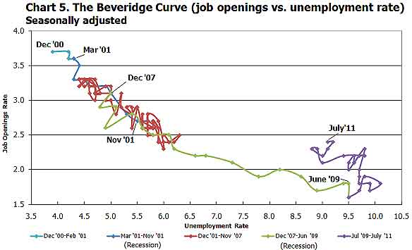
The BLS was kind enough to make a credible Beveridge Curve graph, reprinted below. The Beveridge curve shows the official unemployment rate vs. the job openings rate, over time. If you see a bunch of data points to the far right, that's bad, it means there is long term unemployment and not enough jobs. Look at how we're stuck to the right. July 2011 moved slightly left of June 2011. The green, representing the 2009 time period, shows how fast we went to the right and the purple, which is 2010, 2011, means we are stuck there.
This graph shows working America is in big trouble and considering how the August unemployment report is much worse, don't expect things to get better. Remember, this report is for July, not August.
For the JOLTS report, the BLS creates some fairly useful graphs, some of which were reprinted here, and they have oodles of additional information in their databases, broken down by occupational area. The Saint Louis Federal Reserve also had loads of graphing tools for JOLTS. Below is a reprint of the BLS bubble graph, and the first thing to note is how health and educational employment dwarfs manufacturing. For economies of scale, we really need to see that manufacturing bubble grow and grow, it's about 11% of the total economy which is not good for a host of reasons. You can also see how the housing bubble deflation has laid to waste construction jobs.
Also, bear in mind professional and technical services is notorious to import workers on foreign guest worker Visas, displacing Americans. Employers also quite often put out fictional job openings, demanding perfect skill matches to the point no one on the globe has that experience.
* is defined as the official unemployed plus people who are in part-time
jobs for economic reasons plus the marginally attached. The marginally
attached,
is defined as the official unemployed plus people who are in part-time
jobs for economic reasons plus the marginally attached. The marginally
attached, , are officially not part of the civilian labor force,
  ,
and also not seasonally adjusted. The above graph was created by the
seasonally adjusted levels of the unemployed, part-time for economic
reasons and the marginally attached. The raw U-6 totals can also be
calculated by this formula:
,
and also not seasonally adjusted. The above graph was created by the
seasonally adjusted levels of the unemployed, part-time for economic
reasons and the marginally attached. The raw U-6 totals can also be
calculated by this formula:
 * U6} O")

The 2010 poverty and income data released yesterday morning by the U.S. Census Bureau are yet another reminder of the continued weight of the Great Recession on families in the United States. The Great Recession officially ended in the summer of 2009, but the labor market continued deteriorating through the end of 2009, and the modest economic growth in 2010 was not enough to compensate for those losses. From 2009 to 2010, the number of jobs fell by 658,000, the unemployment rate increased from 9.3 percent to 9.6 percent, and the share of unemployed workers who had been unemployed for more than six months climbed from 31.2 percent to 43.3 percent. Thanks to this deterioration in the labor market, incomes dropped and poverty rose.
AUDIO: Listen to EPI’s press call about the 2010 report
Key findings from the Census Bureau’s report
Poverty
Income
- The poverty rate increased from 14.3 percent in 2009 to 15.1 percent in 2010, representing an additional 2.6 million people living in poverty and bringing the total number of people in poverty in the United States to 46.2 million.
- The poverty rate for children was 22.0 percent in 2010, representing 16.4 million kids living in poverty. In 2010, more than one-third (35.5 percent) of all people living in poverty were children.
- The poverty rate for working-age people (18- to 64- year-olds) hit 13.7 percent in 2010, the highest rate since the series began in 1966. Poverty among the elderly (age 65 and older) poverty was statistically unchanged over the year.
- The poor are getting even poorer. In 2010, the share of the population below half of the poverty line hit a record high of 6.7 percent.
- Nearly one in 10 children (9.9 percent) fell below half of the poverty line in 2010, up from 9.3 percent in 2009.
- Non-Hispanic whites maintained far lower poverty rates than any other racial/ethnic group. Blacks were particularly hard-hit by increases in poverty from 2009 to 2010, increasing 1.6 percentage points to reach a rate of 27.4 percent.
- In 2010, over one-third of black children (39.1 percent) and Hispanic children (35.0 percent) were living in poverty. The poverty rate for families with children headed by single mothers hit 40.7 percent in 2010. Of the 7.0 million families living in poverty in 2010, 4.1 million of them were headed by a single mom.
A quick comment on the effect of ARRA
- Between 2000 and 2010, median income for working-age households fell from $61,574 to $55,276, a decline of roughly $6,300, which is more than 10 percent.
- Disparities in incomes among racial and ethnic subgroups grew in 2010, as racial and ethnic minorities experienced particularly large declines in income. The black household earning the median income is now bringing in $5,494 less than the median black household did 10 years ago (a drop of 14.6 percent) and the median Hispanic household is now bringing in $4,235 less than the median Hispanic household did 10 years ago (a drop of 10.1 percent).
- There were losses across the income distribution in 2010, particularly at the very bottom and the very top. In 2010, incomes of families in the middle fifth of the income distribution fell 0.9 percent, for a total decline of 6.6 percent since 2007. Families at the low end of the scale were hit harder, with the bottom fifth losing 3.5 percent in 2010 and 11.3 percent from 2007 to 2010. The top fifth lost 2.7 percent in 2010, but since their losses in the prior two years were modest, the total decline from 2007 to 2010 was a relatively modest 4.5 percent.
- The median, or typical, inflation-adjusted earnings of men working full-time year-round fell slightly from $47,905 in 2009 to $47,715 in 2010, while the median earnings of full-time year-round female workers stayed essentially flat, at $36,877 in 2009 and $36,931 in 2010.
How did the American Recovery and Reinvestment Act of 2009 (ARRA) affect the 2010 poverty and income numbers? Because ARRA was passed in February and was in the process of ramping up through the end of 2009, its full impact was felt in 2010. ARRA primarily affected these numbers by creating and saving jobs, the earnings from which otherwise would not have been there supporting family incomes. The Congressional Budget Office estimates that the Recovery Act created or saved around one million full-time equivalent jobs in 2009, and 3.4 million jobs in 2010. Without these jobs, the decline in income and increase in poverty would have been much more dramatic. In other words, the new Census Bureau report is ugly, but without ARRA, it would have been much uglier. This underscores the growing impact of the end of ARRA—in the current quarter, ARRA is supporting only 2.3 million full-time equivalent jobs, and the number of jobs supported drops to half a million by the fourth quarter of 2012. This means that the loss of the boost from government action is—and without additional intervention will continue to be—a substantial drag on jobs and family income.
What about the direct income supports in ARRA? Of three major income supports in the stimulus—unemployment insurance, nutritional assistance (food stamps), and tax cuts—only unemployment insurance is counted in the income numbers just released; the income numbers include cash income received from programs such as unemployment insurance, but exclude noncash benefits like food stamps, and are measured before payments of taxes, so they do not reflect reductions in taxes. While unemployment insurance benefits replace a maximum of half of a worker’s prior earnings, these benefits went to workers who were laid off and who had low odds of quickly finding another job (in 2010, there were 5.3 unemployed workers per job opening on average). In other words, these unemployment benefits went to families that otherwise would likely have suffered even steeper income declines, and in some cases dropped below the poverty line. Census data show that 3.2 million people were kept out of poverty in 2010 by unemployment insurance benefits alone.
Poverty: Record highs
Between 2009 and 2010, an additional 2.6 million people slipped below the poverty line, as the poverty rate increased from 14.3 percent to 15.1 percent. The rate represents 46.2 million people living in poverty in the United States. The last time the poverty rate was higher was in 1983, when it was 15.2 percent (as shown in Figure A).
The poverty rate for children in 2010 was 22.0 percent, higher than the overall rate and up more (1.3 percentage-points) than the overall poverty rate, which increased 0.8 percentage points from 2009 to 2010. The 2010 “children’s poverty rate” represents 16.4 million kids living in poverty. In 2010, more than a third—35.5 percent— of all people living in poverty were children.
Nearly all of the decline in poverty achieved during the business cycle of the 1990s has now been reversed. From 1989 to 2000, overall poverty declined by 1.5 percentage points, and child poverty dropped by 3.4 percentage points. From 2000 to 2010, however, poverty increased overall by 3.8 percentage points, and by 5.8 percentage points among children. The large increase in poverty suggests that as anti-poverty policies have come to depend more on paid work as the main pathway out of poverty, the safety net has become less effective in reducing economic hardship when the economy and job market are underperforming.
The poverty rate for working-age people, those 18-64 years old, increased by 0.7 percentage points, from 12.9 percent in 2009 to 13.7 percent 2010, the highest rate since the series began in 1966 (Figure B). Over the same five decades, the poverty rate for persons older than 65 dropped precipitously, due in part to Social Security payments, which have effectively lifted millions of elderly Americans out of poverty. In 2010, the elderly poverty rate, 9.0 percent, was statistically unchanged from 2009.
Figure C displays the share of the population falling below half of the poverty line from 1975–2010. In 2010, 50 percent of the poverty line for a two-adult two-child family was $11,057. This measure tracks the depth of poverty, those living on half the subsistence rate. In 2010, 6.7 percent of people were living below half of the poverty line, up 0.4 percentage points since 2009—a record high share of the population in deep poverty since the Census Bureau began tracking this statistic in 1975. Not shown in the figure but alarming: Nearly one in 10 children (9.9 percent) were below half the poverty line in 2010, up from 9.3 percent in 2009.
As shown in Figure D, poverty rates and changes in those rates have varied across racial and ethnic groups. Non-Hispanic whites experienced the lowest rate of poverty at 9.9 percent, while the rates for blacks and Hispanics were more than two-and-a-half times higher at 27.4 percent and 26.6 percent, respectively. Poverty rates also increased more between 2009 and 2010 for blacks and Hispanics than for other groups.
The 2000s have all but erased any gains to reducing poverty in the 1990s. This recession has only exacerbated the damaging trends over the last decade, leaving some of the most vulnerable populations with large shares living below the poverty line. Figure E shows changes over time in poverty rates for particularly vulnerable populations—children, racial and ethnic minority children, and single-mother families. From 2000 to 2010, black children experienced a 7.9 percentage-point increase in poverty, reaching 39.1 percent. Hispanic children experienced an increase of 6.6 percentage points over the same period, reaching 35.0 percent.
For families headed by single mothers, there was a 7.7 percentage point jump from 2000 to 2010 to 40.7 percent. In 2010, 4.1 million of the 7.0 million families living in poverty were headed by single moms.
Income: Another lost year in a lost decade
From 2009 to 2010, median household income, adjusted for inflation, fell from $50,599 to $49,445, a decline of $1,154, or 2.3 percent. Working-age households—those with a head of household younger than 65 years old—experienced even larger declines because they are most exposed to the labor market and therefore most likely to be affected when the labor market deteriorates. The median income of working-age households fell from $56,742 in 2009 to $55,276 in 2010, a decline of $1,466, or 2.6 percent.
Figure F shows real median income over the last three decades for all households and, starting in 1994 when the data became available, for working-age households. A key point here is the comparison between business cycles. From 1979 to 1989, real median income grew $3,002 (from $46,074 to $49,076); from 1989-2000, it grew $4,088, (from $49,076 to $53,164). But for the first time on record, over the business cycle from 2000-07, incomes did not rise, but fell slightly, from $53,164 to $52,823. And with the weak labor market over this period, the real median income of working-age households fell significantly, from $61,574 to $59,460. This means that working families are weathering the current economic downturn on the heels of one of the worst economic expansions on record.
These figures show that 2010 was but another year of income declines in a decade of declines: From 2000 to 2010, median income for working-age households fell from $61,574 to $55,276, a decline of roughly $6,300, which is more than 10 percent.
Disparities in incomes among racial and ethnic subgroups grew in 2010, as racial and ethnic minorities experienced particularly large income declines, with African Americans getting hit the hardest. Figure G shows real median household income for racial and ethnic subgroups over the last two decades. The median income of non-Hispanic whites declined by 1.3 percent in 2010 and has declined by 5.4 percent since the start of the recession in 2007 . (In dollar terms, it fell from $57,752 to $54,620 over this period). The median African American household experienced a decline of 3.2 percent in 2010 and a total decline of 10.1 percent since 2007 (falling from $35,665 to $32,068). The median Hispanic household experienced a decline of 2.3 percent in 2010 and a total decline of 7.2 percent since 2007 (falling from $40,673 to $37,759).
The Great Recession and its aftermath have wiped out all improvements in median black income since 1996, all improvements in median Hispanic income since 1998, and all improvements in median white income since 1997. The median black household is now bringing in $5,494 less than it did 10 years ago (a drop of 14.6 percent) and the median Hispanic household is now bringing in $4,235 less than it did 10 years ago (a drop of 10.1 percent).
There were losses across the income distribution in 2010, particularly at the very bottom and the very top (see Figure H). In 2010, incomes of families in the middle fifth of the income distribution fell 0.9 percent, for a total decline of 6.6 percent since 2007. Families at the low end of the scale were hit harder, with the bottom fifth losing 3.5 percent in 2010 and 11.3 percent from 2007 to 2010. The top fifth lost 2.7 percent in 2010, but since their losses in the prior two years were modest, the net change from 2007 to 2010 was a relatively modest 4.5 percent. The rise in inequality over the last three years compounds thirty years of increasing inequality. Furthermore, with unemployment expected to remain high for years to come, inequality is likely to increase because weak labor markets have a larger negative impact on income at the middle and low end of the income distribution.
Particularly astonishing over the last three years has been the drop in the number of earners working full-time (35 hours or more per week) and full-year (at least 50 weeks, including paid time off). Between 2007 and 2010, there was a 9.4 million decline in the number of people with full-time, full-year employment and a 3.9 million increase in the number of people with part-time and/or part-year jobs.
As Table 1 shows, a disproportionate share of the erosion in full-time, full-year work over this period was among men—the number of men working full-time, full-year dropped by about 6.6 million between 2007 and 2010, while there was a 2.8 million drop in the number of women working full-time, full-year. However, focusing just on the change from 2009 to 2010, the gender dynamics were reversed, with a 754,000 decline in total employment among men and an 854,000 decline among women. Furthermore, losses were larger among part-time and/or part-year workers in 2010 than among full-time full-year workers, both male and female. Although it is not depicted in the table, the number of “involuntarily part-time workers”—workers who work part-time but want a full-time job (from the Census Bureau’s Current Population Survey)—was virtually unchanged from 2009 to 2010, after increasing by 4.5 million between 2007 and 2009.
In 2010, the median male working full-time, full-year experienced a slight drop in real earnings of 0.4 percent, from $47,905 to $47,715, while the median female working full-time, full-year experienced very little change, with an increase of 0.1 percent, from $36,877 to $36,931 (see Figure I). The persistent high unemployment dampens earnings growth even for those who have full-time, year-round employment. Looking from 2007 to 2010, the shift from full-time, full-year employment to part-time and/or part-year employment contributed to the overall drop in median earnings: The annual inflation-adjusted earnings for the median male worker dropped from $38,524 to $36,676 between 2007 and 2010, and for the female median worker from $27,212 to $26,552.
Conclusion
The new data on income and poverty underscore the real, human consequences of the economic downturn. The labor market is the core building block of family incomes—when the labor market falters and people lose work, hours, and wages, family incomes drop and poverty rises. The Census Bureau’s report shows that much of the income and anti-poverty gains made in the 1990s have been more than erased due to both the weak business cycle from 2000-07 and the lasting effects of the Great Recession. While the Recovery Act stemmed the losses from the Great Recession, it was never big enough to right the economic ship given the scale of the crisis. With unemployment expected to stay above 8 percent well into 2014, it is time for Congress to once again act boldly to create jobs so that America’s residents have the work they need to provide for their families. The jobs plan that President Obama announced last week takes an important step in the direction of a solution that matches the scale of the ongoing crisis. For more on what we can and should be pursuing to generate jobs, see EPI’s Putting America Back to Work.
+++++
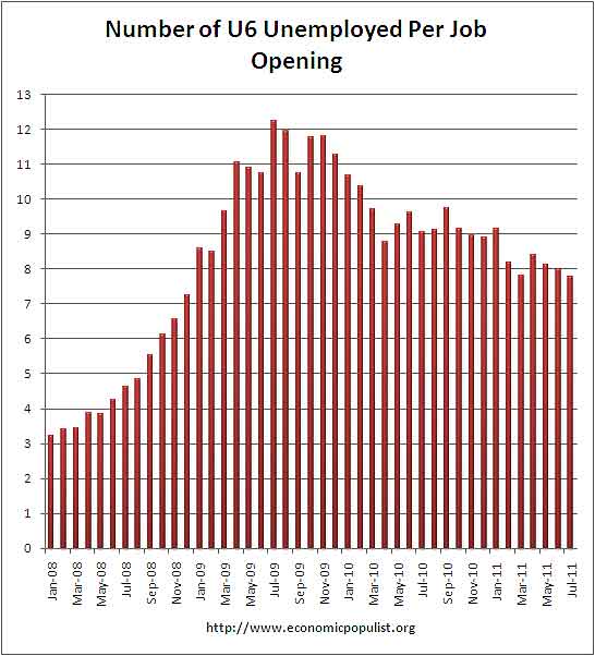
JOLTSIf one takes the official broader definition of unemployment, or U6, in July at 16.1%, the ratio becomes even worse, 7.78* unemployed people per each job opening for July. Below is the graph of number of unemployed, using the broader U6 unemployment definition, per job opening.
If you do not like the use of U6 to look at the real number of people looking for a job to actual opportunities, consider this number. In July 2011, of those not in the labor force, 6,575,000 were actually wanting a job. U-6 only includes 2,785,000 of this number.
The rates below mean the number of openings, hires, fires percentage of the total employment. Openings are added to the total employment for it's ratio.
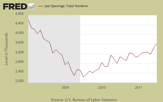
Below are raw job openings, way below pre-recession levels.
- openings rate - 2.4%
- hires rate - 3.0%
- separations rate - 3.0%
Believe this or not, one month past the so called end of the Great Recession, July 2009, job openings have only increased by 1,116,000. July 2009 was the low point of job openings, 2,112,000. That's pathetic. In March 2007, a few months before the start of the recession (December, 2007), the number of job openings was 4,755,000.
We can see some of labor market malaise in the actual hires from July, 3,984,000, which declined by -74,000, or -1.82% from June.
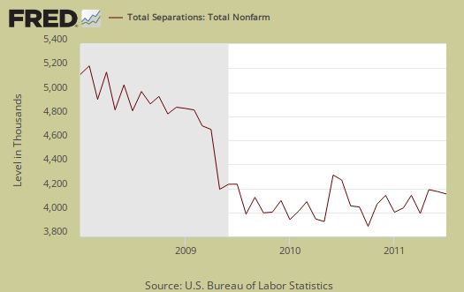
Below are total job separations, 3,920,000, which is a monthly decrease of -73,000 or -1.83%. The term separation means you're out of a job through a firing, layoff, quitting or retirement, so a decrease is good. Yet, notice how separations is almost equal to the number of hires, 3,984,000. Take this as a symptom of the disposable worker syndrome.
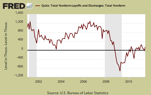
The number of quits or voluntary job separations are still dangerously close to the number of fires, although improved from November 2010, as well as June 2011. Want a choice of employers? Doesn't seem to be much of an option today. Quits were 50% of the total separations whereas layoffs and fires were 43% in July. In June, quits were 48%, whereas layoffs and fires were 44%, so a slight, but certainly not enough, improvement.
Below are quits minus discharges and layoffs. When quits comes close to firings that means people have little choice in employment. You want to see choice, or quits, rise and be much higher than firings. The below graph shows people still do not have many options when it comes to a job.
The JOLTS takes a random sampling of 16,000 businesses and derives their numbers from that. The survey also uses the CES, or current employment statistics, not the household survey as their base benchmark, although ratios are coming from the household survey, which gives the tally of unemployed.
The BLS was kind enough to make a credible Beveridge Curve graph, reprinted below. The Beveridge curve shows the official unemployment rate vs. the job openings rate, over time. If you see a bunch of data points to the far right, that's bad, it means there is long term unemployment and not enough jobs. Look at how we're stuck to the right. July 2011 moved slightly left of June 2011. The green, representing the 2009 time period, shows how fast we went to the right and the purple, which is 2010, 2011, means we are stuck there.
This graph shows working America is in big trouble and considering how the August unemployment report is much worse, don't expect things to get better. Remember, this report is for July, not August.
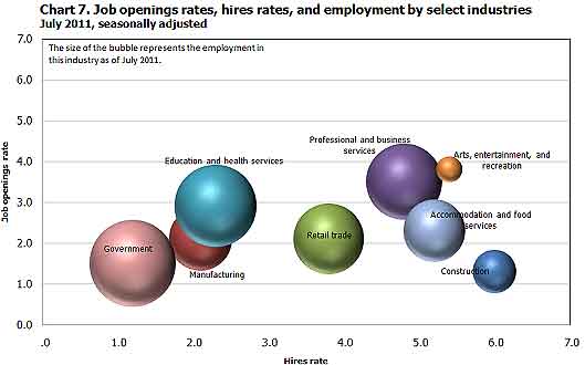
For the JOLTS report, the BLS creates some fairly useful graphs, some of which were reprinted here, and they have oodles of additional information in their databases, broken down by occupational area. The Saint Louis Federal Reserve also had loads of graphing tools for JOLTS. Below is a reprint of the BLS bubble graph, and the first thing to note is how health and educational employment dwarfs manufacturing. For economies of scale, we really need to see that manufacturing bubble grow and grow, it's about 11% of the total economy which is not good for a host of reasons. You can also see how the housing bubble deflation has laid to waste construction jobs.
Also, bear in mind professional and technical services is notorious to import workers on foreign guest worker Visas, displacing Americans. Employers also quite often put out fictional job openings, demanding perfect skill matches to the point no one on the globe has that experience.
*
is defined as the official unemployed plus people who are in part-time
jobs for economic reasons plus the marginally attached. The marginally
attached,, are officially not part of the civilian labor force, ,
and also not seasonally adjusted. The above graph was created by the
seasonally adjusted levels of the unemployed, part-time for economic
reasons and the marginally attached. The raw U-6 totals can also be
calculated by this formula:
where
No comments:
Post a Comment