(Sorry, but two of these charts are misleading. They are accurate. But the spending chart says Obama only increased spending by 7%. It's still way to high because he added some wars to the existing ones that eat up most of the budget. But if he had done just a couple of the things he campaigned he would d do, spending actually would have gone down. The stimulus chart is misleading because even though we might have had 17 months of job increases, the total number of jobs per month is pathetic, and barely over the number of jobs needed to be created just to keep up with the number of workers added every month (152,000). So subtract 152,000 from each of those totals to see what his 'net total job creation per month' number really is.--jef)
Problem: Your right-wing friends are plugged into the FOX-Limbaugh lie machine, and keeps sending you emails about "Obama spending" and "Obama deficits" and how the "Stimulus" just made things worse.
Solution: Here are three "reality-based" charts to send to him. These charts show what actually happened.
Spending
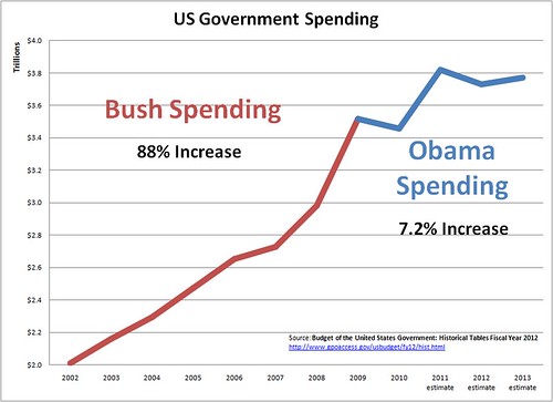
Government spending increased dramatically under Bush. It has not increased much under Obama. Note that this chart does not reflect any spending cuts resulting from deficit-cutting deals.
Deficits
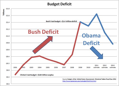
Notes, this chart includes Clinton's last budget year for comparison.
The numbers in these two charts come from Budget of the United States Government: Historical Tables Fiscal Year 2012. They are just the amounts that the government spent and borrowed, period, Anyone can go look then up. Peoplewho claim that Obama "tripled the deficit" are either misled or are trying to mislead.
The Stimulus and Jobs
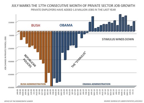
In this chart, the RED lines on the left side -- the ones that keep doing DOWN -- show what happened to jobs under the policies of Bush and the Republicans. We were losing lots and lots of jobs every month, and it was getting worse and worse. The BLUE lines -- the ones that just go UP -- show what happened to jobs when the stimulus was in effect. We stopped losing jobs and started gaining jobs, and it was getting better and better. The leveling off on the right side of the chart shows what happened as the stimulus started to wind down: job creation leveled off at too low a level.
It looks a lot like the stimulus reversed what was going on before the stimulus.
Conclusion: THE STIMULUS WORKED BUT WAS NOT ENOUGH!
More False Things
These are just three of the false things that everyone "knows." Some others are (click through): Obama bailed out the banks, businesses will hire if they get tax cuts, health care reform cost $1 trillion, Social Security is a Ponzi Scheme or is "going broke", government spending "takes money out of the economy."
Why This Matters
These things really matter. We all want to fix the terrible problems the country has. But it is so important to know just what the problems are before you decide how to fix them. Otherwise the things you do to try to solve those problems might just make them worse. If you get tricked into thinking that Obama has made things worse and that we should go back to what we were doing before Obama -- tax cuts for the rich, giving giant corporations and Wall Street everything they want -- when those are the things that caused the problems in the first place, then we will be in real trouble.validate carbon trading in the US.
No comments:
Post a Comment